March 5, 2026
Fitness Website Design: What Turns Browsers into Members
TL;DR
A gym website needs to do more than list class schedules. The right design elements motivate visitors to take action, and the wrong ones send them to a competitor.
In This Article
Most gym websites look the same. A hero image of someone mid-deadlift, a class schedule buried three clicks deep, and a "Contact Us" page that doesn't give anyone a compelling reason to reach out. It's no surprise that so many fitness businesses struggle to convert website visitors into actual members.
Your website is often the first real interaction someone has with your gym. They found you on Google, clicked through, and now they're deciding in about five seconds whether your facility is worth visiting. That decision depends almost entirely on how your website looks, how it's organized, and how easily they can find what they need.
This guide breaks down the design elements that turn fitness website visitors into trial bookings and gym membership sign-ups, whether you run a full fitness centre, a boutique studio, or a personal training space.
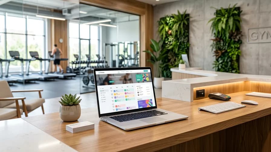
Put Your Class Schedule Front and Centre
Class schedules are the most-visited content on any fitness website, and they're usually the hardest thing to find. If someone has to click through multiple pages or download a PDF to see when your yoga class runs, you've already lost them.

Your class schedule should be accessible from the main navigation, ideally in one click. Display it in a clean, filterable format that lets visitors sort by class type, instructor, day, or time. If you use a booking system like Mindbody or Glofox, embed the live schedule directly on your site so it always stays current.
Make sure the schedule works flawlessly on mobile. Most people checking gym class times are doing it from their phone, often while they're deciding whether to go today. A schedule that's hard to read or navigate on a small screen is a conversion killer.
Include a brief description for each class type, whether it's fitness classes, workout classes, or personal training sessions, linked to a dedicated page that explains it in more detail. Someone who has never done a HIIT class needs different information than a regular. Give both what they need without cluttering the schedule itself.
Lead with a Trial Offer or Free Class CTA
The single most important element on a fitness website is a clear, compelling call to action that lowers the barrier to entry. For most gyms and studios, that means a free trial, a discounted first week, or a free intro class.
This CTA should appear above the fold on your homepage. Not buried in a sidebar. Not hidden on a pricing page. Right there, front and centre, the moment someone lands on your site. "Try a Free Class" or "Start Your 7-Day Trial" tells the visitor exactly what to do next and makes it feel low-risk.
The trial offer page or form should be simple. Name, email, phone number, and the class or date they want to try. Every extra field you add reduces the number of people who complete the form. You can collect more detailed information when they show up.
Repeat this CTA throughout your site. After your class descriptions, on your about page, at the bottom of blog posts. Every page should give visitors a clear path to taking the first step. If you're not sure whether your current CTAs are working, our guide to effective landing pages covers the fundamentals.
Show Your Facility, Not Stock Photos
People want to see where they'll be working out. Stock photos of models in a generic gym do nothing to build trust or excitement. They actually do the opposite, making your gym feel impersonal and raising the question of what the real space looks like.
Invest in professional photography of your actual facility. Shoot during a class so the space looks alive and energetic. Capture the equipment, the layout, the locker rooms, and the front entrance (so first-time visitors can find you easily). Natural lighting and real people create an authentic impression that stock photos never will.
Video is even more powerful. A 30 to 60-second walkthrough tour of your facility gives potential members a genuine feel for the atmosphere. Show a class in progress, the energy of the space, trainers interacting with members. Embed this video prominently on your homepage. It doesn't need to be a cinematic production. It needs to be real.
If you offer different training areas (a main gym floor, a functional training zone, a studio for yoga or spin), photograph each one and present them as a gallery or within the relevant class pages. Let people see exactly what they're getting.
Trainer Bios That Build Confidence
For many people, the trainers are the reason they choose one gym over another. Your trainer page shouldn't be an afterthought with a headshot and a one-line bio. It should be a selling point.
Each trainer bio should include their certifications, specializations, training philosophy, and a personal touch that makes them feel approachable. What got them into fitness? What kind of clients do they work best with? A few sentences that show personality go a long way toward helping someone imagine working with that trainer.
Professional headshots matter here. Not casual snapshots, but not stiff corporate portraits either. A confident, friendly photo in the gym environment works best. If your trainers are comfortable on camera, short intro videos are even better.
Link each trainer to the classes or programs they lead. If someone searching "personal trainer near me" or "trainer near me" lands on your site and sees a trainer who specializes in exactly what they need, the path to booking a session becomes obvious and natural.
Pricing Transparency Builds Trust
The fitness industry has a long history of hiding gym membership prices behind "Contact us for a quote" or "Come in for a consultation." Online, this approach backfires. People expect to find pricing information on a website. When they can't, they assume the worst: either it's too expensive, or you're going to pressure them with a hard sell.

You don't need to list every possible price point if your offerings are complex. But give visitors a clear sense of what to expect. Display your membership tiers with starting prices. List your personal training packages with general pricing. If you offer a free trial, make that the focus and let pricing details come after someone has experienced your gym firsthand.
Comparison tables work well for gyms with multiple membership levels. Lay out what's included at each tier so people can self-select. This reduces friction and saves your front desk staff from answering the same pricing questions repeatedly.
If you genuinely can't publish pricing (because it's highly customized), at minimum explain your pricing structure. "Personal training packages start at $X per session" is infinitely better than "Contact us to learn more."
Mobile-First Design Is Not Optional
The majority of fitness website traffic comes from mobile devices. People look up gyms while commuting, check class schedules between meetings, and search for "gym near me" while walking down the street. If your website doesn't perform perfectly on a phone, the majority of your potential members are having a poor experience.
Free Offer
Want to know what's actually hurting your website?
We'll review your site and tell you exactly what to fix, no strings attached.
Get Your Free AuditMobile-first design means building the mobile experience first and then expanding it for larger screens, not the other way around. Key priorities for mobile fitness websites include:
- Tap-friendly buttons: CTAs should be large enough to tap easily with a thumb, with plenty of spacing between interactive elements
- Fast load times: compress images, minimize code, and aim for a load time under three seconds on mobile networks
- Click-to-call: your phone number should be a tappable link on every page
- Simplified navigation: a clean mobile menu that gets visitors to class schedules, pricing, and trial bookings in one tap
- Maps integration: an embedded map with a "Get Directions" link so people can navigate to your gym directly
Test your website on multiple devices regularly. What looks fine on your phone might break on a different screen size. A solid web design approach accounts for the full range of devices your visitors use.
Testimonials and Transformation Stories
Social proof is the most persuasive element on any fitness website. People want to see that others like them have achieved results at your gym. Testimonials and member success stories provide that proof in a way that no amount of marketing copy can match.
Go beyond simple text quotes. If members are willing, feature their stories with before-and-after photos, a brief description of their journey, and what they enjoy about training at your facility. Video testimonials are even more compelling. A 60-second clip of a real member talking about their experience carries more weight than a paragraph of polished copy.
Place testimonials strategically throughout your site, not just on a dedicated testimonials page. Put a member quote on your homepage. Feature a success story on your personal training page. Add a review snippet next to your trial offer CTA. Every page benefits from a reminder that real people are getting real results.
Make sure your testimonials reflect the diversity of your membership. If you want to attract beginners, feature stories from people who started as beginners. If you serve a range of ages, show that range. Prospective members are looking for someone who looks like them and has goals similar to theirs.
Creating a Sense of Community Online
The best gyms aren't just places to work out. They're communities. Your website should reflect that. People who are shopping for a gym aren't just looking for equipment and classes. They're looking for a place where they'll feel welcome and motivated.
Show your community through photos and content. Group shots after a tough class. Social events. Charity workouts. Member milestones. An active Instagram feed embedded on your site can reinforce this sense of community without requiring extra content creation.
If you run challenges, events, or member appreciation activities, feature them on your website. A "Community" or "Events" section signals that your gym is more than a transactional relationship. It's a place people belong to.
Your tone of voice throughout the site contributes to this too. Write like a welcoming, knowledgeable trainer, not like a corporate marketing department. Use "you" and "we" language. Be encouraging without being cheesy. The goal is to make someone feel like they'd fit in the moment they walk through the door.
Don't Forget the Practical Details
It's easy to focus on the big design elements and forget the basics that visitors actually need. These small details reduce friction and make the difference between someone booking a visit and someone bouncing to a competitor.

- Location and directions: an embedded Google Map, your full address, and notes about parking. If parking is tricky, give specific instructions. If you're in a multi-unit building, explain how to find the entrance.
- Hours of operation: prominently displayed, including holiday hours. If staffed hours differ from open gym hours, make that clear.
- What to bring: a quick note for first-time visitors about what to wear, whether to bring a towel, and where to go when they arrive.
- Contact options: phone, email, and a contact form at minimum. If you use WhatsApp or text messaging for bookings, include those too.
- Accessibility information: if your facility is wheelchair accessible or has specific accommodations, mention it. This shows thoughtfulness and helps a wider range of people feel welcome.
These details might seem minor, but they address the last-minute hesitations that keep people from showing up. Anything you can do to make the first visit feel less intimidating will improve your conversion rate.
Frequently Asked Questions
How much does a fitness website cost?
A professionally designed gym or fitness studio website typically ranges from $3,000 to $10,000 in Canada, depending on the features you need. A basic informational site with class schedules and a booking integration falls on the lower end. A fully custom site with video content, member portals, e-commerce for merchandise, and advanced booking systems costs more. The investment pays for itself quickly when the site consistently converts visitors into members.
Should my gym website have online booking?
Yes. Online booking removes friction from the sign-up process. If someone decides at 10 PM that they want to try your 6 AM yoga class, they should be able to book it right then. Most gym management platforms (Mindbody, Glofox, Zen Planner) offer embeddable booking widgets that integrate directly into your website.
How often should I update my gym website?
Your class schedule and pricing should always be current. Beyond that, aim to update your content at least monthly. Add new member testimonials, update trainer bios when certifications change, post about upcoming events or challenges, and refresh your photography at least once a year. A website that looks the same as it did two years ago suggests a business that isn't evolving.
Do I need a blog on my gym website?
A blog isn't strictly necessary, but it helps significantly with SEO. Publishing helpful content about fitness topics (workout tips, nutrition advice, guides for beginners) brings in search traffic from people who may become members. It also positions your gym as a knowledgeable authority. Even one or two posts per month makes a difference over time.
What's the most important page on a gym website?
The homepage, because it sets the first impression and directs visitors to everything else. But the trial offer or free class landing page is a close second, because that's where conversions actually happen. If you can only optimize two pages, focus on those.
If your gym or studio website isn't converting visitors the way it should, the issue is usually in the design, the structure, or the user experience. Request a free website audit and we'll pinpoint exactly what's holding your site back and what changes will turn more browsers into paying members.