January 27, 2021
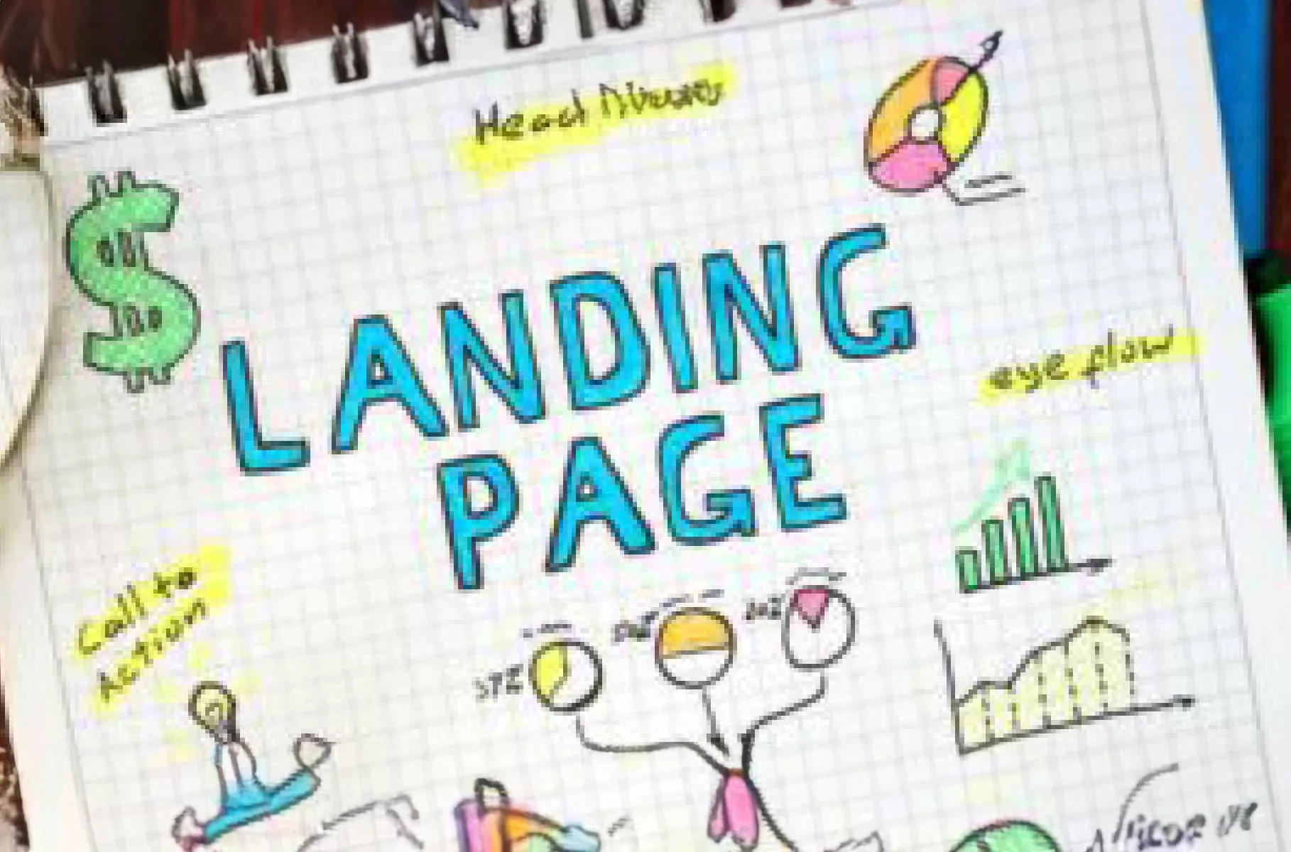
Best Practices to Create an Effective Landing Page
TL;DR
A landing page has one job: get the visitor to take action. These best practices cover headline structure, CTA placement, and everything else that determines whether your page actually converts.
In This Article
When running a Google Ads or Facebook ads campaign, it’s crucial to create a compelling campaign that will entice someone to give you that all-important click-through.
However, as exciting as getting that click can be, the shopper has only started their sales journey. Where they go from your ad is just as important as the ad itself, which is why you need to create an effective landing page in order to convert them into qualified leads.
Following best practices to create high-converting landing pages is known as conversion rate optimization.
What is conversion-rate optimization (CRO)?
Conversion rate optimization refers to the strategy you use to raise the percentage of people who take action on your landing page (calculated by dividing the number of conversions by the number of landing page visitors), whether it’s to fill out a form, download a brochure, or simply press a button.

Good CRO practices involve understanding who your customer is, what they respond to, and why they might be abandoning your landing page. You can then use this information to tailor the content on the landing page to convert the highest number of people.
What are the elements of a good converting landing page?
What would go on our landing page optimization checklist? Here are 9 important elements to include on a high-converting landing page that will help make your Google Ads campaign a complete success!

Create a standalone landing page: If you send your Google Ads or Facebook ad customer to a web page on your site where the menu is visible, they might click away to explore the rest of your content. In most cases, this is great! But when it comes to your landing page, the person might not come back to complete the offer. In other words, once they’re gone, chances are they’ll stay gone, hurting your conversion rate.
Ensure your customer has only one of two ways out of your landing page: your call-to-action button, or the back button on their browser.
Write a compelling headline: Headlines can make or break your landing page. In less than one second, the reader will use your headline to determine whether to scroll down or move on. Be snappy and fun while showing empathy for the customer’s problem, but most of all connect your headline directly with the referring ad for a smooth flow.
Instapage offers some great landing page headline examples you can customize for your own landing page.
Use an impactful hero image: Marketers often use hero images at the top of their landing pages that show the results of using their product or service. For example, a recruiting firm might show an image of a manager shaking a candidate’s hand, or an investment advisor could show a happily retired elderly couple. You can experiment with different images until you find the one that resonates best with your audience.
Here are more important tips on choosing the right hero image for your campaign.
Write value-focused copy: When creating landing page content, write from the perspective of your customer. Focus on the unique value you bring, the benefits of using your product or service, and what results they can expect. Crisp, short, and to the point is best practice here, along with three to five bullet points to break up copy blocks. Remember to add a sense of urgency so people won’t hesitate to punch that button.
If you need help writing copy from an outside perspective, reach out to a professional copywriter who specializes in high-converting content.
Highlight social proof: Have great reviews on your product or service? Show them off on your landing page! Positive testimonials do more than just make us feel good about ourselves – they’re also powerful marketing tools that allow real people to testify as to how you’ve helped them achieve great results.
1 – 3 testimonials work well, along with a full name (or name and initial) and headshot, if possible. In the case of B2B offers, you can opt to include a company name as well.
Make your CTA copy compelling: If you’ve ever responded to an offer or signed up for something online, you responded to that company’s call to action (CTA). This is where the customer journey culminates into a decision as to whether to convert.
CTAs typically consist of three elements: copy, a form, and a button (we’ll go into the latter two in a moment). The copy in your CTA should highlight the main benefits your customer will get from your offer, in a crisp, punchy way that really hits the point home. You can even pose a question for maximum impact, for example: “Are you ready to double your income right now?” HubSpot offers these great examples of CTA copy to help inspire you.
Free Offer
Want to know what's actually hurting your website?
We'll review your site and tell you exactly what to fix, no strings attached.
Get Your Free AuditUse the right form length: The rule of thumb for landing page form length has traditionally been “less is more”. Some companies only collect email addresses, while others also ask for a first name so they can tailor their future messaging. However, you might require more information, such as a phone number, URL, or location to gather the data you need to complete the conversion.
Feel free to experiment with different form lengths until you find what brings in the most leads. Here are some great examples of landing page form design you can try when thinking about what would work best for you.
Create the most pressable button ever: All the elements on your landing page are crucial to success, but many marketers will argue that the call-to-action button is most important. After all, this is where the person actually converts, so be sure to make your button as pressable as possible!
It’s important to use a button colour that feels on-brand, but keep in mind that different colours trigger different feelings and motivate different actions. If you’re not sure which to pick, Optinmonster offers some valuable button colour advice that might make the choice easier.
Another important part of your button is the copy. Let’s avoid boring button copy such as “Learn More” or “Download”. Really entice your customer with a copy that pops but still stays aligned with the offer. “Try now for FREE” is always good for a trial offer, “Sign up Now” for a loyalty program, or “Attract More Leads NOW” for digital marketing service. Check out these CTA buttons to get the copy ideas flowing.
Use exit popup forms: You can use exit popup forms to try to capture people if they decide to leave the page without converting. These forms usually have very brief text and a button, similar to a CTA form, and sometimes also include an image.
You can reinforce the landing page offer with a fear-of-loss message (“Are you sure you don’t want to quit smoking?”), or an appeal for their email address for future marketing campaigns (“Sorry to see you go. Can we keep in touch?”). The best part of exit popups is that you can use them throughout your website too!
What is a good landing page conversion rate?
Unbounce measured the average conversion rate of businesses across several industries to help companies gauge how their campaigns stacked up against their competitors. The results may actually surprise you.

The highest average conversion rate calculated was just over 6%, while the lowest was 2%. Of course, this all depends on the type of offer, pricing, and other factors, but the data indicates that you don’t need a large conversion rate to make the effort of designing an effective, high-converting landing page, in conjunction with your Google Ads campaign, well worth the effort.
Frequently Asked Questions
What is the difference between a landing page and a regular website page?
A landing page is built around a single goal, typically capturing a lead or completing a transaction. Regular website pages serve multiple purposes and contain navigation menus that let visitors explore freely. A landing page strips away those distractions so the visitor’s only real choices are to take your offer or leave. That focus is what makes well-designed landing pages so much more effective for ad campaigns.
How long should a landing page be?
It depends on what you are asking the visitor to do. Low-commitment offers such as a free download or newsletter signup can work with a short, single-screen page. Higher-commitment offers such as a consultation booking or product purchase usually benefit from a longer page that addresses objections and builds trust before the call to action. Let the complexity of the decision guide the length.
Should every Google Ad point to a dedicated landing page?
Yes, whenever possible. Sending ad traffic to your homepage or a general service page nearly always results in lower conversion rates. A dedicated page that mirrors the language and promise of the ad creates a consistent experience that reduces friction and helps more visitors complete the action you want.
If your landing pages aren't converting the way you'd like, request a free audit and we'll review your pages and pinpoint what's getting in the way of more leads.