November 22, 2024
Boost Your Local Rankings: The Power of Mobile Optimization

TL;DR
More than half of all local searches happen on mobile. If your site doesn't load fast and look right on a phone, you're losing customers before they ever reach your contact page.
In This Article
Why Mobile Optimization Matters for Local SEO
Ever noticed how everyone seems glued to their phones? It’s not just for scrolling through social media - local searches are a massive part of daily life, and most of them are happening on mobile devices. Whether it’s hunting down the nearest coffee shop or booking a plumber, your potential customers are searching on the go. If your website doesn’t perform well on mobile, you’re practically handing business over to the competition.

Google’s shift to mobile-first indexing has changed the game. The mobile version of your site now has the biggest influence on how you rank. So if your mobile experience isn’t up to scratch, your rankings - and your visibility - could take a hit. In fact, over 50% of web traffic now comes from mobile devices, making mobile optimization a core part of any effective local SEO strategy.
How Mobile-First Indexing Impacts Search Rankings
Here’s the deal: Google’s mobile-first indexing means it looks at the mobile version of your site first when deciding rankings. If your site stumbles on mobile, you’re likely missing out on a huge chunk of traffic - and potential customers.
Key Takeaways:
- Make sure your mobile site is just as detailed and polished as your desktop version. Every bit of content, every link, every image - don’t cut corners.
- Remember, first impressions matter. If your site feels clunky on a phone, visitors might not stick around to see what you offer.
Essential Mobile Optimization Tips for SEO
Optimizing for mobile doesn’t mean a complete site overhaul. Sometimes, small adjustments make all the difference. If your site needs more than tweaks, a full website redesign built with mobile-first principles can make a significant difference. Here are a few tried-and-true tips:
Responsive Design
- Your site should look great on any screen, whether it’s a tiny phone or a large tablet. A responsive design is the key here.
- Use fluid grids and flexible images so they automatically adjust, no matter the device.
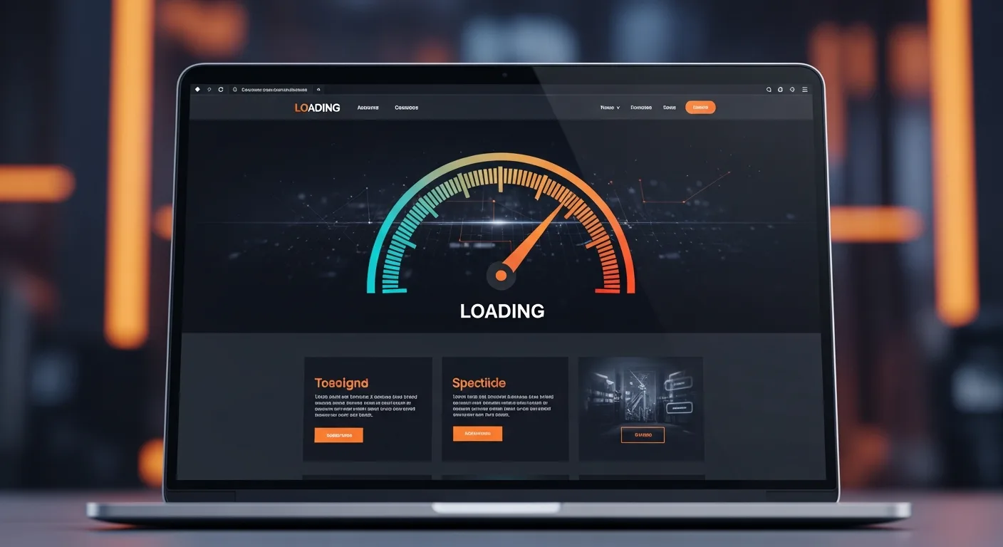
Speed Up Loading Times
- Nobody has the patience for a slow-loading website. Compress images to keep them lightweight, and trim down JavaScript that might be slowing things down.
- Browser caching can speed up repeat visits - anything to shave off a second or two helps.
Simple Navigation
- Keep your menus simple and straightforward. Mobile users want clear paths, not endless clicks.
- Make sure your phone number is clickable. Let’s make it as easy as possible for people to reach you.
Optimizing Your Google Business Profile for Mobile Users
Your Google Business Profile (GBP) is often the first thing mobile users see. If it’s not optimized for small screens, you might lose them before they even reach your website. Around 30% of all mobile searches are related to location, making it vital to ensure your profile looks great on mobile.
Mobile Tips for GBP
- Upload bright, high-quality photos that look sharp on mobile devices. First impressions start here.
- Update your hours, services, and contact details regularly. If people see outdated info, they might assume you’re closed.
- Use Google Posts to share updates that catch the eye - mobile users tend to scroll, so give them something worth stopping for.
Why Mobile-Friendly Content is Essential
Content that’s designed for desktop screens rarely translates well to mobile. People on mobile devices want answers, and they want them fast.
Tips for Mobile Content
- Stick to short, direct paragraphs. Long blocks of text are a no-go on mobile.
- Use bullet points to break up information - easy to read, easy to digest.
- Keep it concise. Mobile users are often in a hurry, so get to the point quickly.
Avoid Common Mobile SEO Mistakes
Getting mobile SEO wrong can be costly. Here are some common missteps you’ll want to steer clear of:
Slow Loading Times
- Heavy images and overloaded pages will turn users away. Keep it light and fast. As page load time increases from 1 second to 3 seconds, the probability of a bounce increases by 32%, making speed a crucial factor in retaining visitors.
- From our experience, we’ve seen that clients who improve their site speed often notice a boost in search rankings. If your competitors have faster websites, you need to match their speed to stay competitive. If they don’t, use this as an opportunity - by optimizing your load times, you can gain an edge in search visibility.
Cluttered Design
- A crowded, messy design can make navigation a nightmare. Keep it clean and simple.
Intrusive Pop-Ups
- Nobody likes trying to close a stubborn pop-up that blocks half the screen. Keep them minimal and easy to dismiss.
Tools to Test Your Mobile Usability
It’s not enough to assume your site is mobile-friendly - test it. We rely on a range of tools to ensure mobile optimization:
Free Offer
Want to know what's actually hurting your website?
We'll review your site and tell you exactly what to fix, no strings attached.
Get Your Free Audit
- Google’s Mobile-Friendly Test: A quick check for mobile compatibility to verify that your site meets Google’s mobile standards.
- Google Lighthouse: Provides in-depth insights into performance, accessibility, and user experience to help pinpoint areas for improvement.
- GTmetrix: Analyzes what might be slowing down your mobile load times and offers recommendations on how to fix it.
- Blisk: A developer-focused browser that allows us to preview how websites look across various devices and screen resolutions, making it easier to catch mobile-specific issues.
Pro Tip: Don’t just test on one phone - try it out on multiple devices. What looks good on a Samsung might not look as sharp on an iPhone. These tools help ensure your site performs well across the board.
The Impact of Mobile Optimization on Traffic
Let’s get real: If your mobile site isn’t user-friendly, you’re likely losing out on business. A well-optimized mobile experience means more people stay on your page longer, leading to better engagement and more conversions. According to Google, the majority of people who conduct a local search on their smartphone visit a business within 24 hours, and a significant portion of those searches result in a purchase.
When customers are searching for local services, they’re often ready to make a decision. If your mobile site delivers, they’re far more likely to choose you over the competition.
What’s Next for Mobile in SEO
Mobile’s importance is only going to grow. Here are a few trends to watch that might impact your local SEO strategy:
- Voice Search: More mobile users are turning to voice search. Incorporate conversational keywords to capture these queries.
- Mobile Payments: Streamline the checkout process with mobile-friendly payment options like Apple Pay and Google Pay. These options make transactions faster and more secure, encouraging users to complete purchases directly from their mobile devices.
- App Integration: If you have an app, ensure it’s indexed by Google. It’s a great way to enhance visibility alongside your website.
Make Your Business Mobile-Ready
Mobile optimization isn’t just a trend - it’s a crucial part of reaching your audience. A mobile-friendly site can increase visibility, connect you with local customers, and give you an advantage over the competition. Start optimizing your mobile experience today to secure your place in search rankings.
We’ve worked with many businesses to successfully adapt to mobile-first, and we’re here to help yours, too. Want to see what mobile optimization can do for your local SEO? Schedule a free introductory call and let’s chat about how to make your business look its best - no matter the screen size.
Frequently Asked Questions
Does mobile optimization actually affect local search rankings?
Yes, directly. Google uses mobile-first indexing, which means it evaluates the mobile version of your site when determining rankings. A slow or broken mobile experience can push you down in local results, even if your desktop site is excellent.
How do I know if my site is considered mobile-friendly by Google?
Use Google's Mobile-Friendly Test tool, which gives you a pass or fail grade along with specific issues to fix. Google Lighthouse and GTmetrix also provide detailed performance breakdowns, including mobile load speed and usability scores.
What is the most common mobile SEO mistake local businesses make?
Slow load times are the biggest culprit. Large, uncompressed images and too much JavaScript are usually to blame. Even a one-second delay in load time can meaningfully increase your bounce rate, which signals to Google that users aren't finding what they need.
Should I build a separate mobile site or use responsive design?
Responsive design is the standard approach and what Google recommends. A single site that adapts to any screen size is easier to maintain and avoids the duplicate content and redirect issues that come with separate mobile sites.

Not sure how your site performs on mobile? Request a free audit and we'll break down your mobile speed, usability, and the local ranking opportunities you might be missing.