March 24, 2026
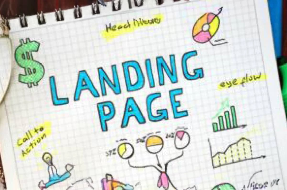
What Makes a Landing Page Convert? The Essentials Small Businesses Get Wrong

TL;DR
Most small business landing pages fail for the same reasons: too many goals, weak headlines, and CTAs buried below the fold. Here's what actually drives conversions.
In This Article
A landing page has one job: get a specific visitor to take a specific action. Not inform, not impress, not cover every service you offer. One action. When a landing page isn't converting, it's almost always because something in the design is working against that job.
Here are the mistakes that come up most often and what to do instead.
One Page, One Goal
The most common landing page mistake is trying to do too much. A page that asks visitors to book a call, download a guide, watch a video, view your services, and follow you on Instagram is asking them to make too many decisions. When people face too many choices, they often make none.

Every landing page should have a single conversion goal. One call to action, repeated consistently from top to bottom of the page. The navigation menu is often worth removing entirely on a dedicated landing page, because every link is an exit ramp away from the action you want visitors to take.
If you're running separate campaigns for different services or audiences, each campaign deserves its own landing page. Sending Google Ads traffic for "emergency plumber Hamilton" to your general homepage sends the visitor to the wrong page and wastes the click.
The Headline Does Most of the Work
Most visitors decide within a few seconds whether to keep reading or leave. The headline is what determines that. A weak headline loses people before they've seen any of your actual value proposition.
A strong landing page headline does one of three things: states the outcome the visitor wants, addresses the problem they're trying to solve, or makes a specific and credible claim. "Hamilton's Most Trusted HVAC Company" is vague. "Emergency Furnace Repair in Hamilton, Available 24/7" tells the visitor exactly what they get and whether it applies to them.
Test your headline by reading it without any other context. Would someone who just arrived on the page know immediately what you're offering and who it's for? If not, rewrite it until the answer is yes.
The CTA Has to Be Above the Fold
Above the fold means visible without scrolling. On desktop, that's the top 600 to 700 pixels. On mobile, it's even less. If a visitor has to scroll to find out what you want them to do, a meaningful percentage of them will leave before they get there.
Your primary call to action, whether that's a button, a form, or a phone number, should be visible the moment the page loads. Not at the bottom after three paragraphs of explanation. Put it up top, label it clearly with the action it triggers ("Book a Free Consultation," "Get Your Quote," "Call Now"), and repeat it further down the page as well for visitors who scroll.
Button copy matters too. "Submit" converts worse than "Get My Free Quote." "Click Here" converts worse than "Book a Call." Make the button label describe what happens next, not just the mechanical action of clicking.
Social Proof Belongs Near the Decision Point
People deciding whether to trust a business they've never used look for evidence that others have. Reviews, testimonials, case study snippets, client logos, and star ratings all serve this function. The placement matters as much as having them.

Social proof placed near the call to action does more work than social proof buried on a testimonials page nobody visits. A five-star Google rating with a review count displayed next to your "Book Now" button addresses the trust hesitation at the exact moment the visitor is deciding whether to act.
For service businesses, specific testimonials outperform generic ones. "They helped us rank on page one for our main keywords within six months" is more persuasive than "Great service, highly recommend." Specificity signals credibility.
Free Offer
Want to know what's actually hurting your website?
We'll review your site and tell you exactly what to fix, no strings attached.
Get Your Free AuditForm Length Determines How Many People Complete It
Every field you add to a contact form reduces the percentage of people who complete it. This is a consistent finding in conversion research. The question to ask about every field is: do I actually need this information before the first conversation, or am I collecting it out of habit?
For most service businesses, name, email or phone number, and a brief description of what they need is enough to qualify a lead and start a conversation. Everything else can be collected on the call or in a follow-up form. If your form has seven fields and your conversion rate is low, removing three of them and retesting is one of the highest-leverage changes you can make.
On mobile especially, long forms are abandonment machines. People typing on a phone keyboard will give up at the third required field if it's not something they can answer in a few words.
Page Speed Is a Conversion Factor
A landing page that takes more than three seconds to load loses a significant percentage of visitors before they've seen anything. On mobile, that window is even shorter. A well-designed landing page that loads slowly will consistently underperform a plainer page that loads fast.
The main culprits for slow landing pages are unoptimized images, render-blocking scripts, and too many third-party tracking tools loading at once. If your page feels slow, run it through Google's PageSpeed Insights and work through the specific recommendations it surfaces. Load time improvements are often among the fastest conversion wins available.
Match the Page to the Ad That Sent the Visitor
Message match is one of the most underrated conversion factors. If someone clicks an ad for "free website audit" and lands on a page about your full range of services, there's a disconnect. The visitor is looking for what the ad promised. When the page doesn't immediately deliver that, they question whether they're in the right place and often leave.

The headline and first paragraph of your landing page should mirror the language in the ad or link that brought the visitor there. If your ad says "Book a Free Call," your landing page headline should reference the free call. Same terminology, same offer, same message. That continuity reduces doubt and keeps visitors moving toward the conversion.
Frequently Asked Questions
Should a landing page be separate from my main website?
It depends on the campaign. For paid advertising campaigns with a specific offer, a standalone landing page with no navigation typically outperforms sending traffic to your regular website. For organic traffic or general service inquiries, a well-optimized service page on your main site works fine. The key variable is whether the destination page is specifically built to convert the traffic coming to it.
How long should a landing page be?
Long enough to answer the visitor's main objections and short enough that they don't lose the thread. For high-trust, low-cost offers (like a free consultation), shorter pages often convert better. For high-ticket or complex services where trust takes more building, longer pages with more evidence and detail tend to work better. Test both if you have the traffic to do it.
What's the most important thing to fix on a low-converting landing page?
Start with the headline and the CTA. If the headline doesn't immediately communicate what you offer and who it's for, visitors leave before anything else has a chance to work. If the CTA is buried, weak, or unclear, people who are interested still don't convert. Fix those two things before changing anything else.
If you want a purpose-built landing page designed to convert your specific traffic, or a review of why your current page isn't performing, our free website audit covers conversion issues alongside SEO and technical findings.